
Improving conversion across segments through pricing page redesign
Role: UX Manager
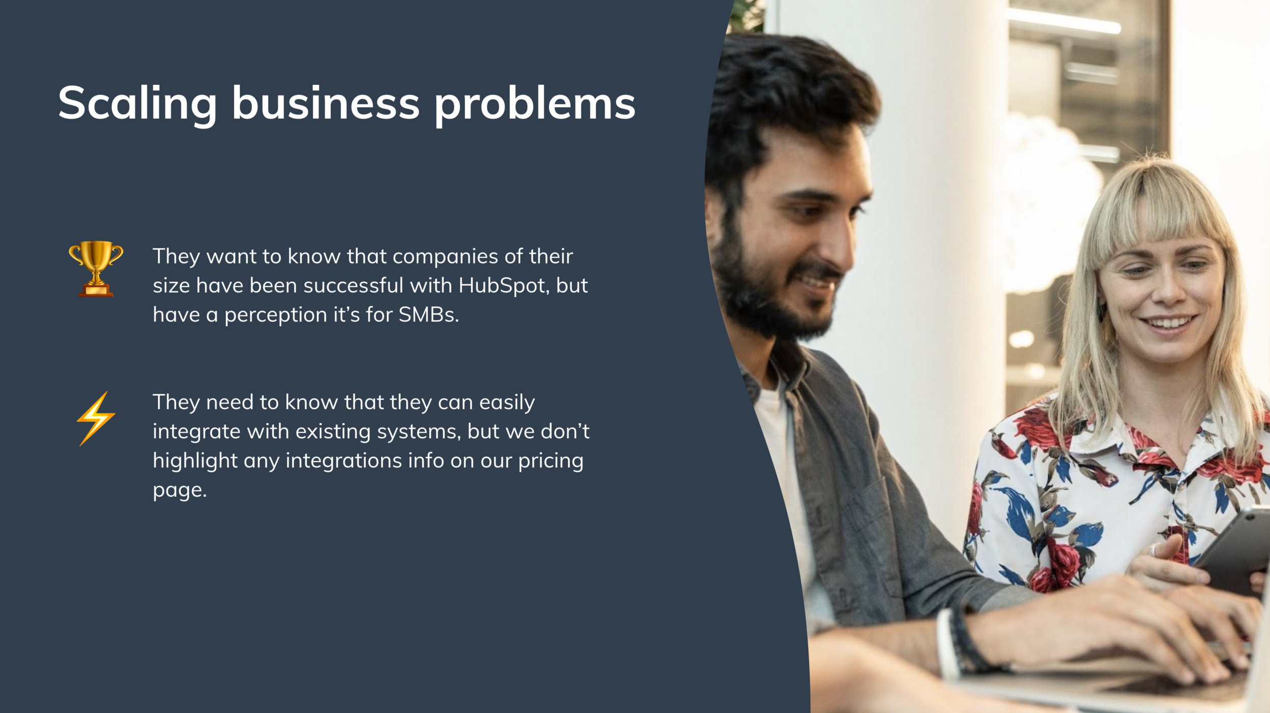
Context
In the past two years, HubSpot had added two new hubs to its product line, offering:
Marketing Hub
Sales Hub
Service Hub
CMS Hub
Operations Hub
Each hub was offered at the Starter, Professional, and Enterprise level.
HubSpot doubled down on its “bimodal strategy,” committing to serving two distinct segments:
Small businesses (1-5 employees), who made up the largest volume and typically spent ~$50 per month on software.
Scaling businesses (100-200 employees), who made up a smaller (but growing) volume and typically spent ~$800+ per month on software.
All UX projects across Growth Monetization needed to consider these two segments, but on the pricing page specifically, we also needed to consider:
Current customers who wanted to upgrade their plan (generally Starter to Professional)
Internal Sales reps who used the pricing page as an enablement tool
Identifying the opportunities
While HubSpot was serving multiple segments on the pricing page, it had only one version of the pricing page. It was possible that, by trying to serve everyone, we weren’t serving anyone.
Our current pricing page had a horizontal navigation featuring our five hubs and free tools. As we continue to grow, this would not be scalable. There was a big opportunity to proactively update the IA.
Recent experimentation on the pricing page was almost always flat. We had the opportunity to try taking a bigger swing to increase conversion rates and improve general usability and comprehension.

HubSpot’s initial pricing page
Manager decision point
As the team’s UX manager, I consulted with the Monetization engineering lead and group product manager. Together, we decided to recommend the triad explore the option of a full redesign.
Working group
This project was being run by the Growth Core Buying Experience triad, consisting of:
Associate product manager
Product designer
Content designer/researcher
Tech lead
However, since the triad was relatively junior and the project was a top priority for the Monetization pillar, close mentorship was provided to the triad by Monetization leaders:
Engineering lead
Senior product manager
Me (UX manager)
Getting started
To understand the scope of a potential redesign, we first had to better understand our segments’ user problems on the pricing page, form an opinion on which we could reasonably solve, and prioritize them. To do this, we:
Reviewed quantitative and historical qualitative data to gauge how our segments interact with the pricing page
Conducted interviews with internal Sales reps to understand how our customers (and they themselves) use our pricing page
Cut our foundational user testing results by segment to find trends in usability issues
Once we used this data to identify usability issues by segment, we prioritized them based on pervasiveness and the impact they would have on customers’ likelihood of converting.


Creating a plan
With segmented user problems clearly established, I asked the triad to form an official opinion on whether we wanted to proceed with traditional, iterative experimentation or launch a comprehensive redesign.
Given the scope of the upcoming pricing and packaging changes, as well as the very different needs of each customer segment, the team opted for a redesign. Our product designer was named project DRI (directly responsible individual).
Setting the KPIs
The KPIs we would use to measure success were:
Ecommerce monetization (Starter)
Expected MRR driven by PQLs (Professional & Enterprise)
Usability score
as well as the ability to solve for scale.
Kick-off
Once the team formalized the decision to pursue a redesign, I helped them organize a kick-off with all relevant stakeholders and interested parties. The goals were to:
Provide general awareness of the redesign
Ensure alignment on what we were and were not solving for
Provide project timelines
Give clarity on how stakeholders can follow along with progress and offer feedback
The team also created an internal Wiki, which they used as a centralized location to house relevant resources and keep stakeholders updated on the progress of the project.

Manager support
My product designer immediately got to work on designs, consulting with our pricing & packaging team. The changes they were making were relatively small, and they were frustrated with feedback from stakeholders that they needed to “think bigger” and “take bigger swings.”
I offered support by:
Pulling my content designer from other projects so they could act as a true partner for my designer.
Helping them host a design workshop with designers from relevant areas of the business in order to spark new ideas.
Creating designs
Our designer and content designer got to work creating revised mocks. As they created new variations and explored different options, the triad would go back to their prioritized user problems and discuss how well the design/content was solving them. If the triad decided a problem was not appropriately solved, the designer and content designer would make revisions.
This process continued until the entire triad was bought into the design.
Manager support
Throughout the project, there was a lot of confusion around what the designer was responsible for as project DRI and what the PM was responsible for.
To solve for this, I created a document (link) to outline the elements of an effective DRI (with feedback from product and engineering leads). This helped me better coach my designer on being a DRI and kept lines of ownership clear.
Getting design feedback
Once the triad was satisfied with their designs, they kicked off a “roadshow” to get feedback from stakeholders from product marketing, SEO, web strategy, pricing and packaging, etc. This feedback was then incorporated into the design.
User testing
With designs that the team and stakeholders felt good about, the team kicked off user testing. This consisted of:
Unmoderated user testing with small and scaling businesses
Moderated user testing with current HubSpot customers
In-person interviews with internal Sales reps
These tests gave us a better indication of how well we were solving our customer problems (and if we were creating new usability problems in the process).
Creating an experimentation plan
While we were recruiting for user testing, we were also creating an experimentation plan. During our pre-mortem, we decided that splitting the pricing page into two tabs was the riskiest element of the new design (see visual below). We would therefore test that as a separate experiment.
Once the data (hopefully) de-risked the two-tab navigation, we would test the rest of the redesign in one experiment. While we generally test one variable at a time, we decided to test multiple variables because:
We needed to wrap up testing (and possible iterations) before pricing & packaging changes rolled out.
We knew small swings weren’t moving the needle.
We were most interested in the impact of radical change, not individual variables.
We hoped that extensive user testing / stakeholder interviews de-risked our efforts.
Reducing risk
We successfully de-risked our two-tab navigation via experimentation.
This design change had no significant impact on assisted or e-commerce monetization rates for our Starter, Professional, and Enterprise plans.
We did, however, see free signups decrease. We decided to make our free plans more visible in the final designs.
User testing was also successful, as users’ abilities to complete core tasks on the pricing page increased and users responded particularly well to the new ‘compare’ feature.

Revised pricing page for small businesses.

Revised pricing page for scaling businesses

Revised pricing page for existing HubSpot customers
Hand-off
Even though I left HubSpot before the final experiment results, this project reinforced the value of involving partnering teams early—especially when UI changes influence revenue strategy. The alignment work done up front de-risked implementation and set the team up for a clean launch.